Your Aura at Work
Case Study
BRAND IDENTITY
SOCIAL MEDIA DESIGN
-
Ilona needed a brand redesign for Your Aura at Work (YAW), the Human Design education and coaching sub-brand of Ilona Pamplona. YAW wasn’t gaining traction, and she felt its existing brand identity no longer reflected her business or the experience she wanted to create.
-
Starting from the ground up, we identified her archetype (the Magician), clarified her business goals, analyzed the competitive landscape, and crafted a brand personality that aligned with her vision and values.
-
The result is a distinctive brand that authentically reflects Ilona’s personality while positioning her business for future growth. We look forward to sharing performance metrics after the official launch.
“I recently worked with Nevine of Radish Studio for a rebrand project, and she knocked it out of the park. I came in with a clear vision, but what I appreciated most was that Nevine didn’t just execute it, she elevated it. She gently steered me away from choices that would’ve read as campy and toward something that actually felt like me. A lot of people think branding is a logo and a color palette. Nevine builds you an entire identity. If you want a brand that’s actually YOU, Radish Studio is who you call!”
ILONA, YOUR AURA AT WORK
Primary Logos & Secondary Marks
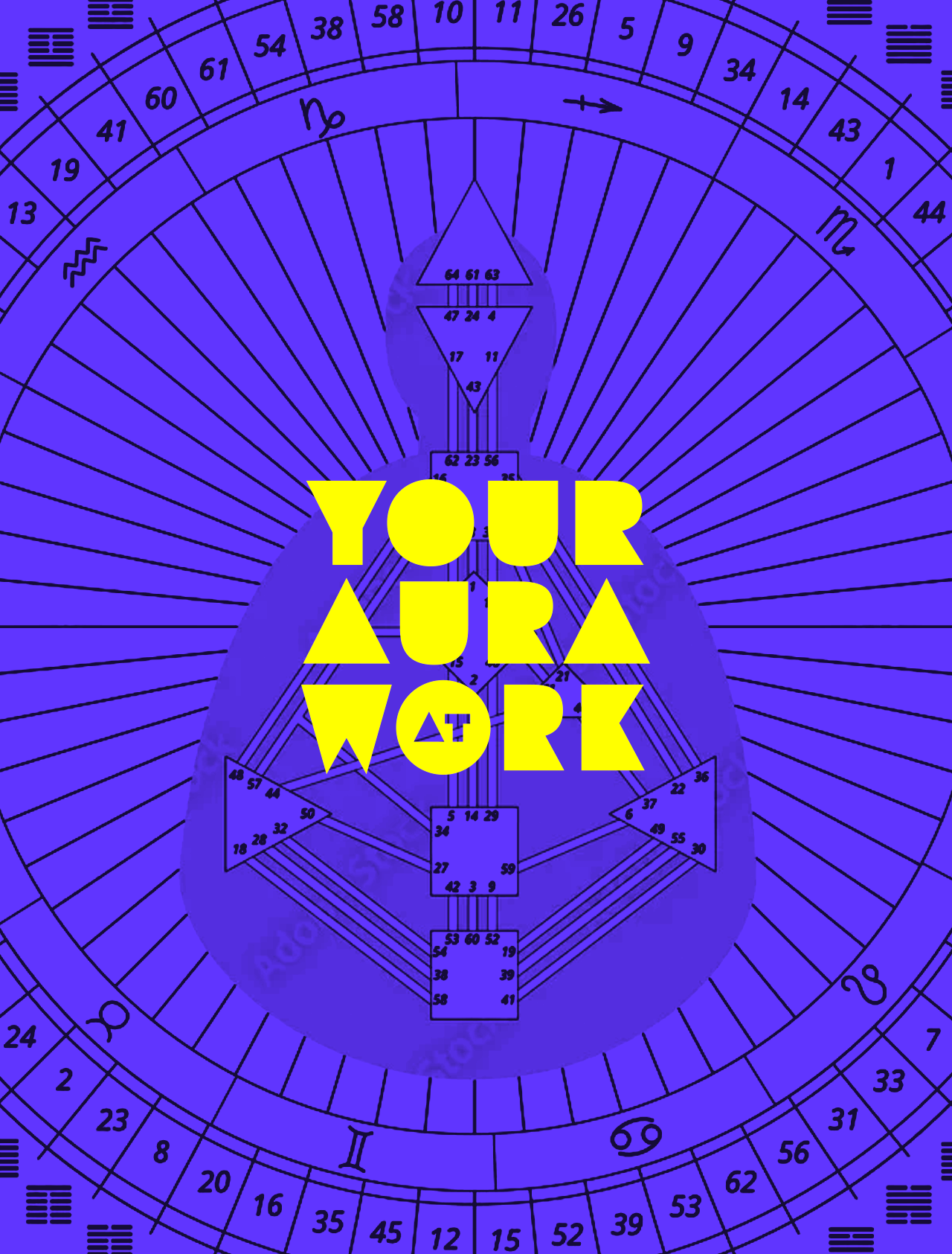
Ilona envisioned a logo that embodied the revealing nature of Human Design. We designed a wordmark that uses positive and negative space to conceal and reveal details, reflecting the process of uncovering deeper insights. Inspired by the shapes found within the BodyGraph, the identity is both symbolic and memorable.
The adaptive logo suite includes a primary stacked logo, a horizontal lockup, a badge, a monogram, and an avatar, providing flexibility across digital and print applications.
Brand Suite
A bold geometric palette was paired with a series of dynamic patterns to reflect the brand’s vibrant personality and reinforce its distinctive visual identity. YAW’s typography was chosen to align with the geometric nature of the brand.
Aura Symbols
Human Design is built around five core energy types (auras). We developed a visual system of custom icons, patterns, and color palettes to represent each one. This visual system informed the design of YAW’s Instagram content and served as the foundation for creating personalized Human Design charts.
Instagram Posts
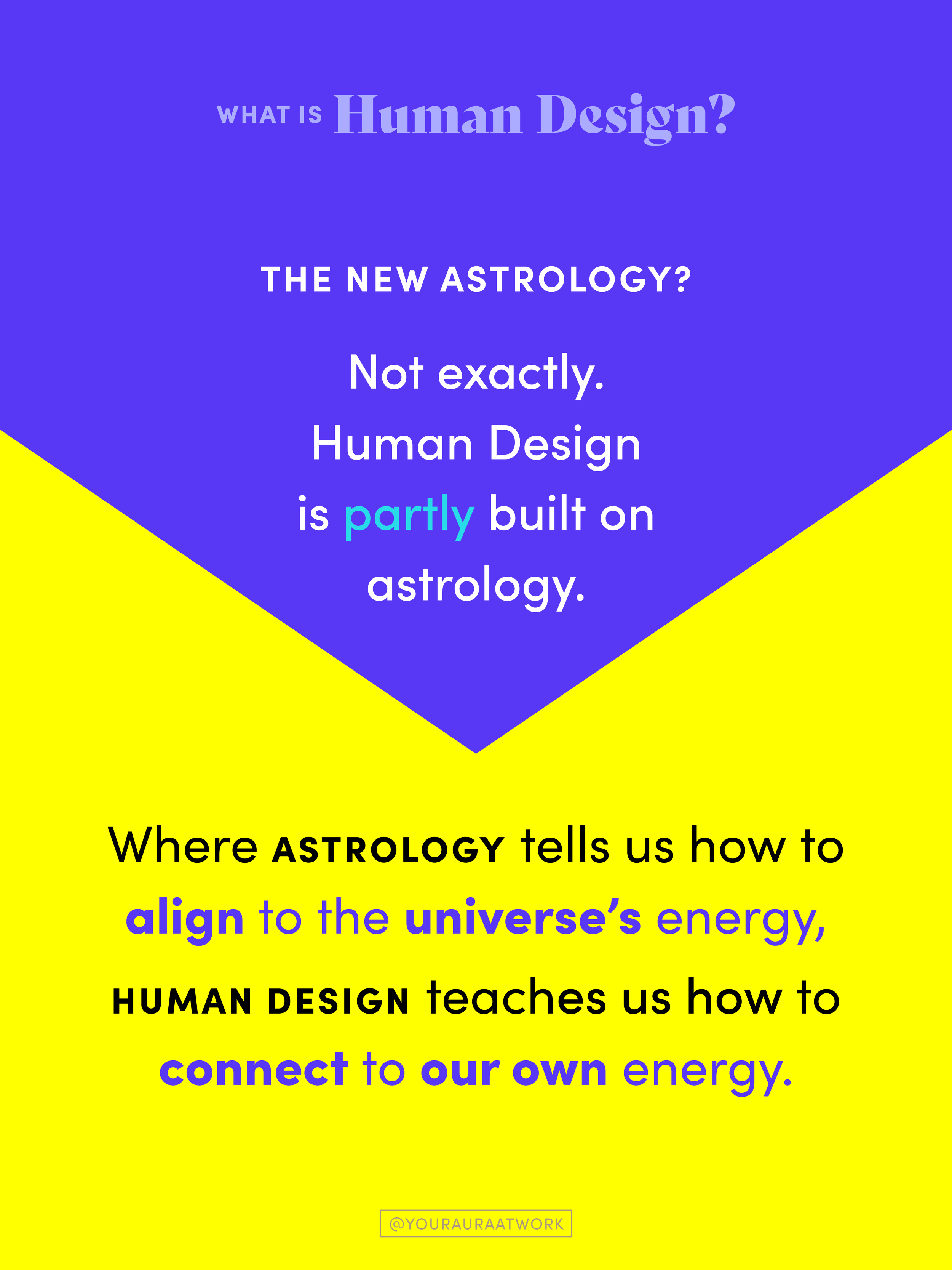
YAW’s Instagram content was designed to educate, inform, and simplify the complexities of Human Design through clear, engaging visuals. Black-and-white photography was used throughout to create contrast and allow the brand’s vibrant rainbow color system to take center stage.
Introduction
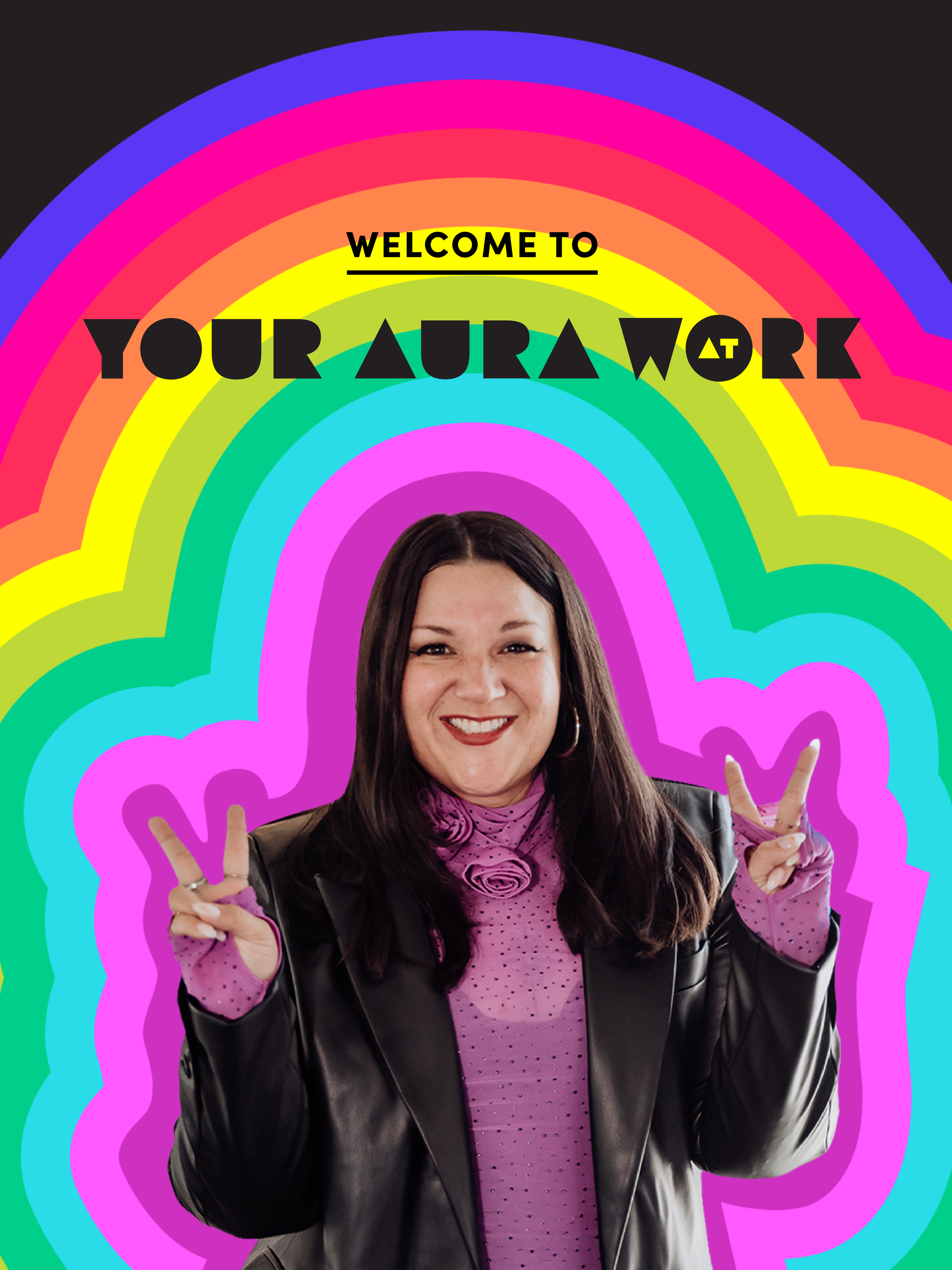
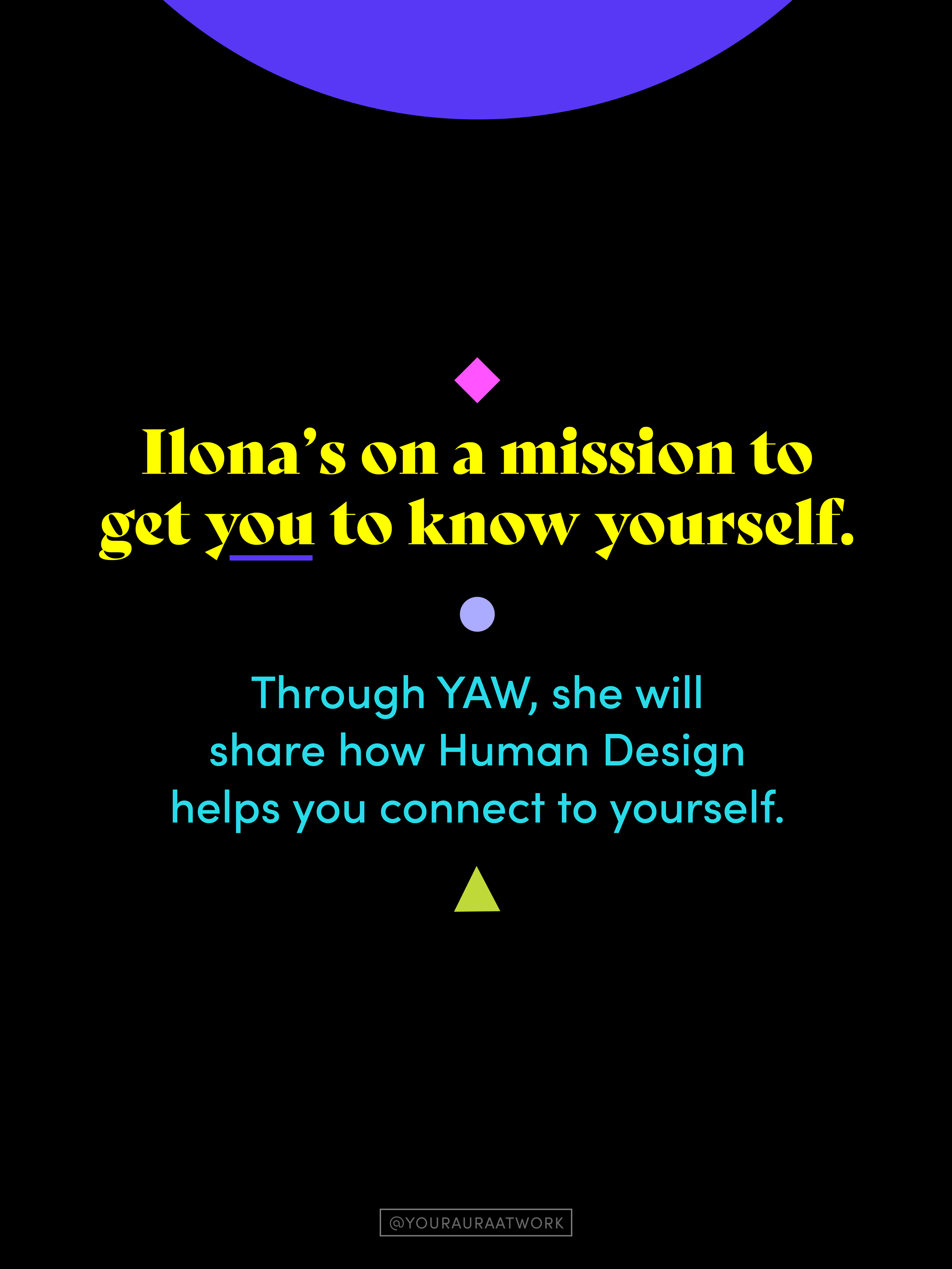
To introduce Ilona to her new followers, we created a rainbow ‘aura’ around her as a nod to the aura types used in Human Design.
We used the basic shapes from the human design chart, aka ‘BodyGraph’ as visual separators and kept the colors to a minimum, using iris and black as anchoring colors.
Designed this Way
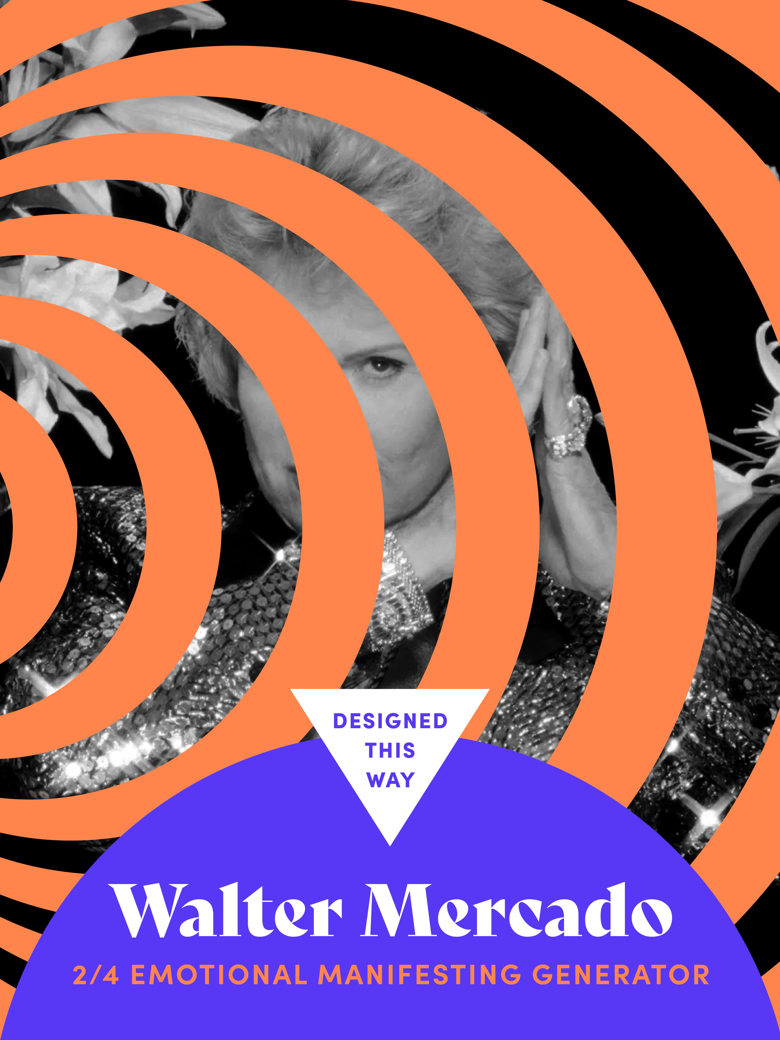
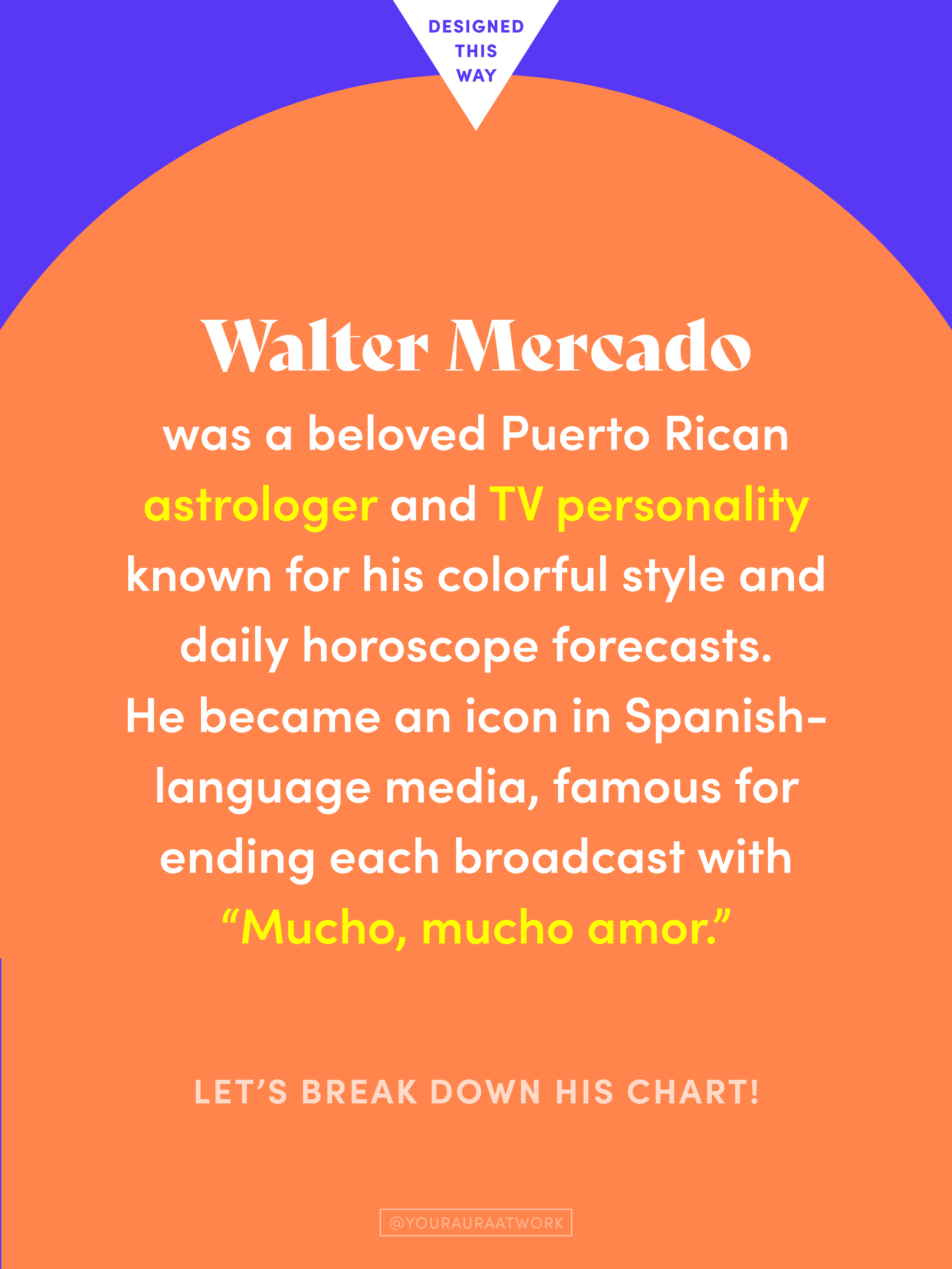
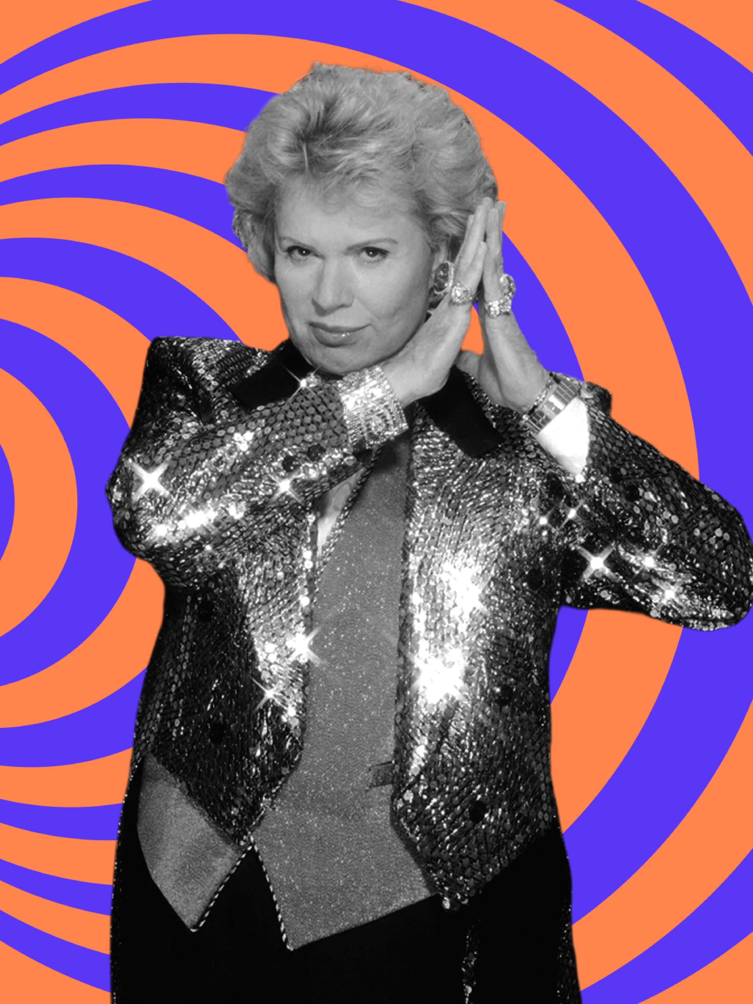
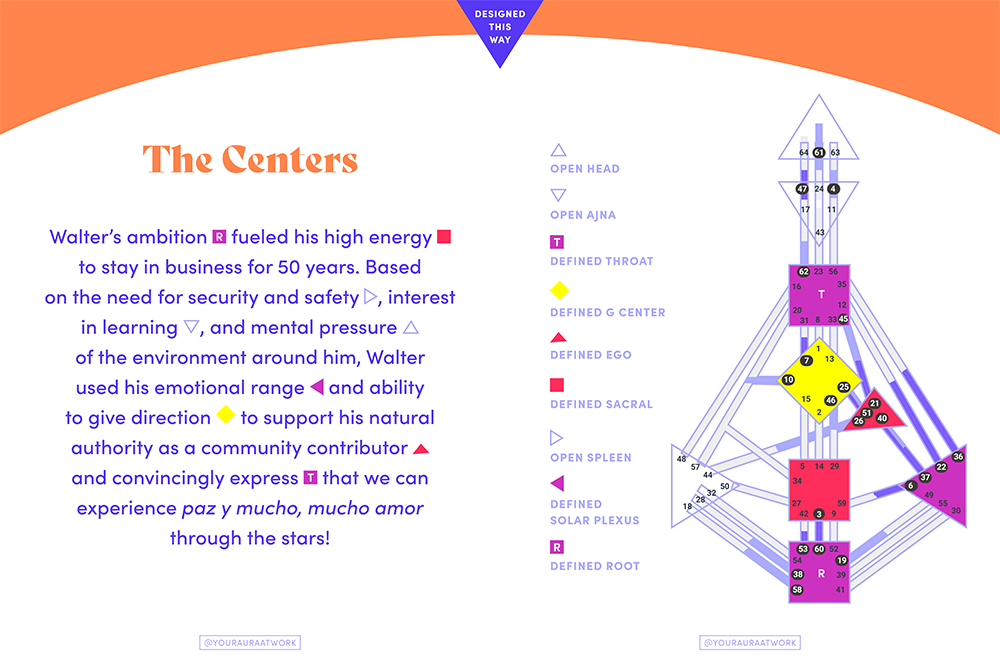
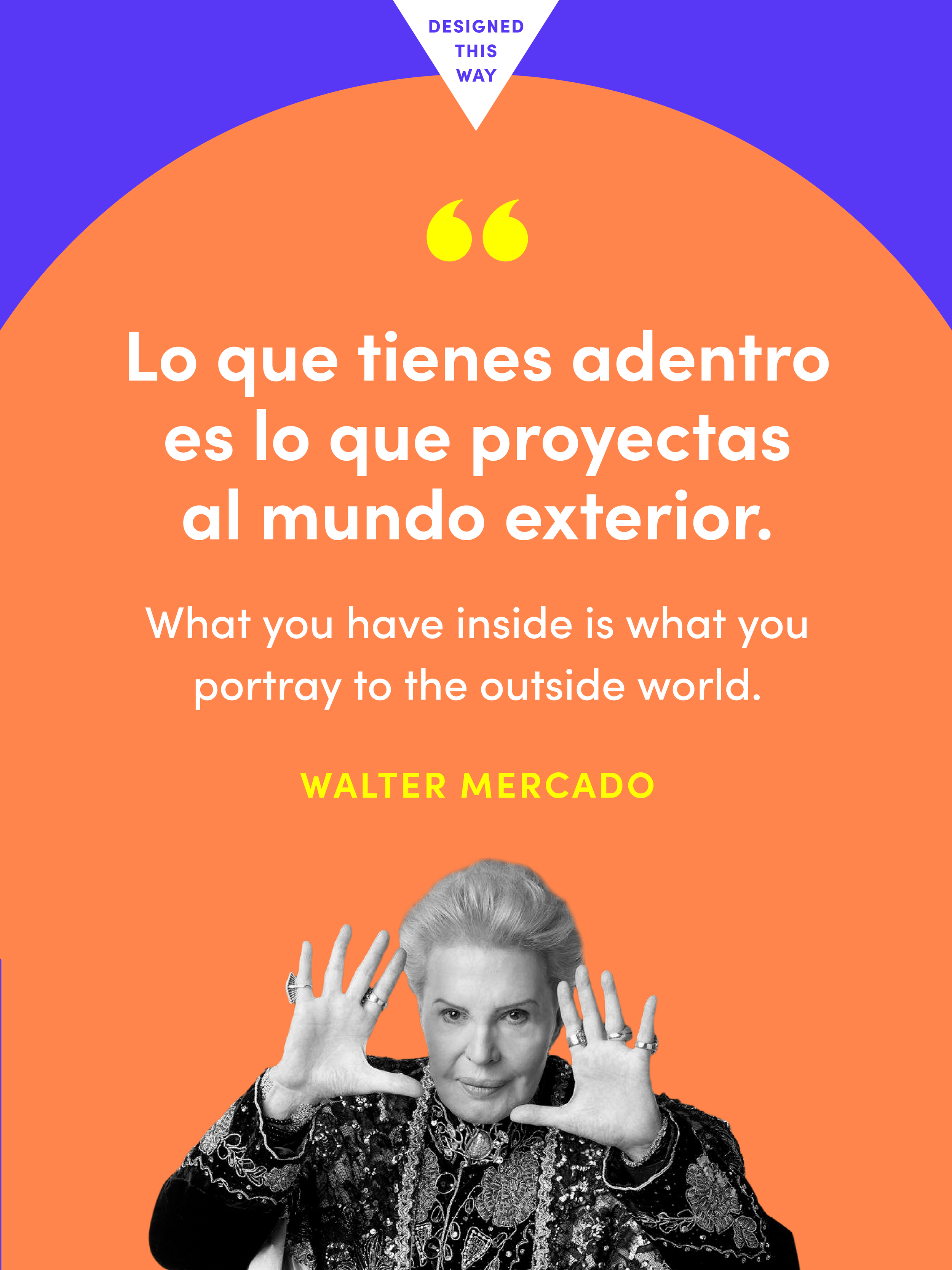
Ilona created ‘Designed this Way’ to break down a featured person’s Human Design chart.
We created a look and feel for this recurring series that uses our aura symbol & color system. The colors and patterns associated with the Manifesting Generator aura were used in this example.
Quotations
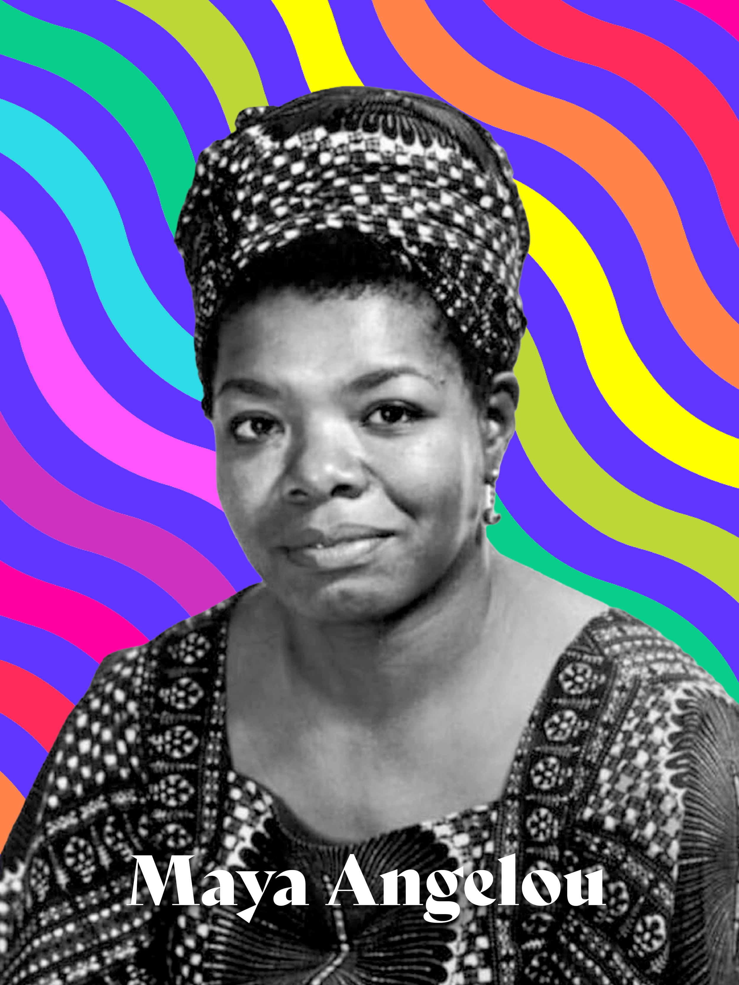
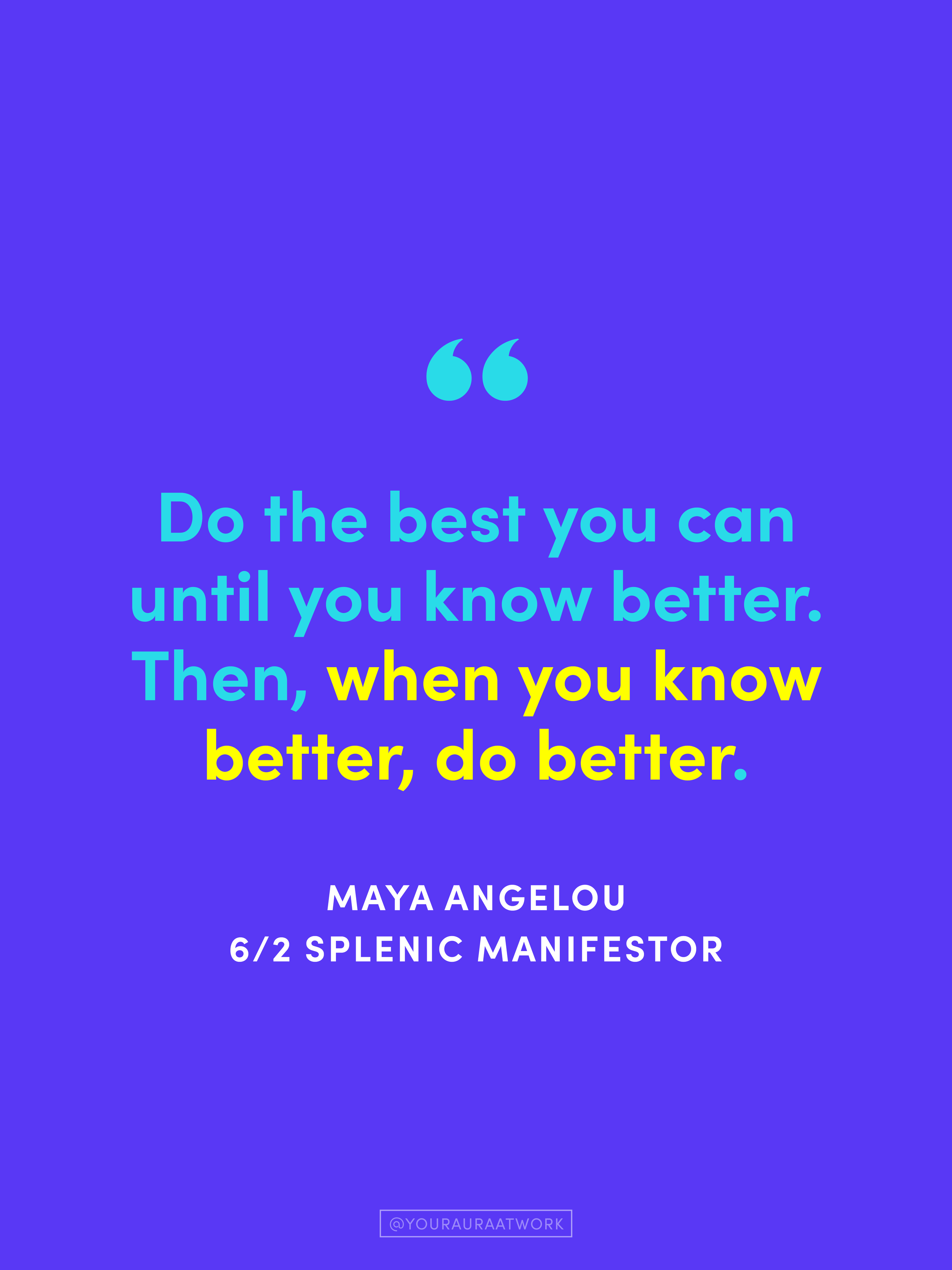
A recurring series of inspirational quotations on Ilona’s Instagram featured one of YAW’s signature rainbow patterns.
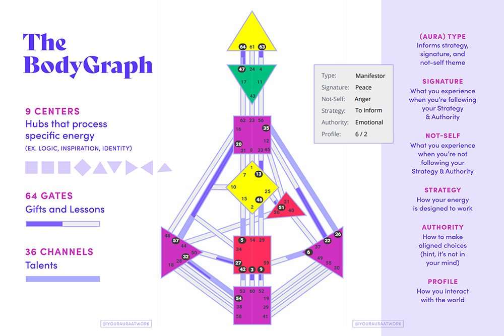
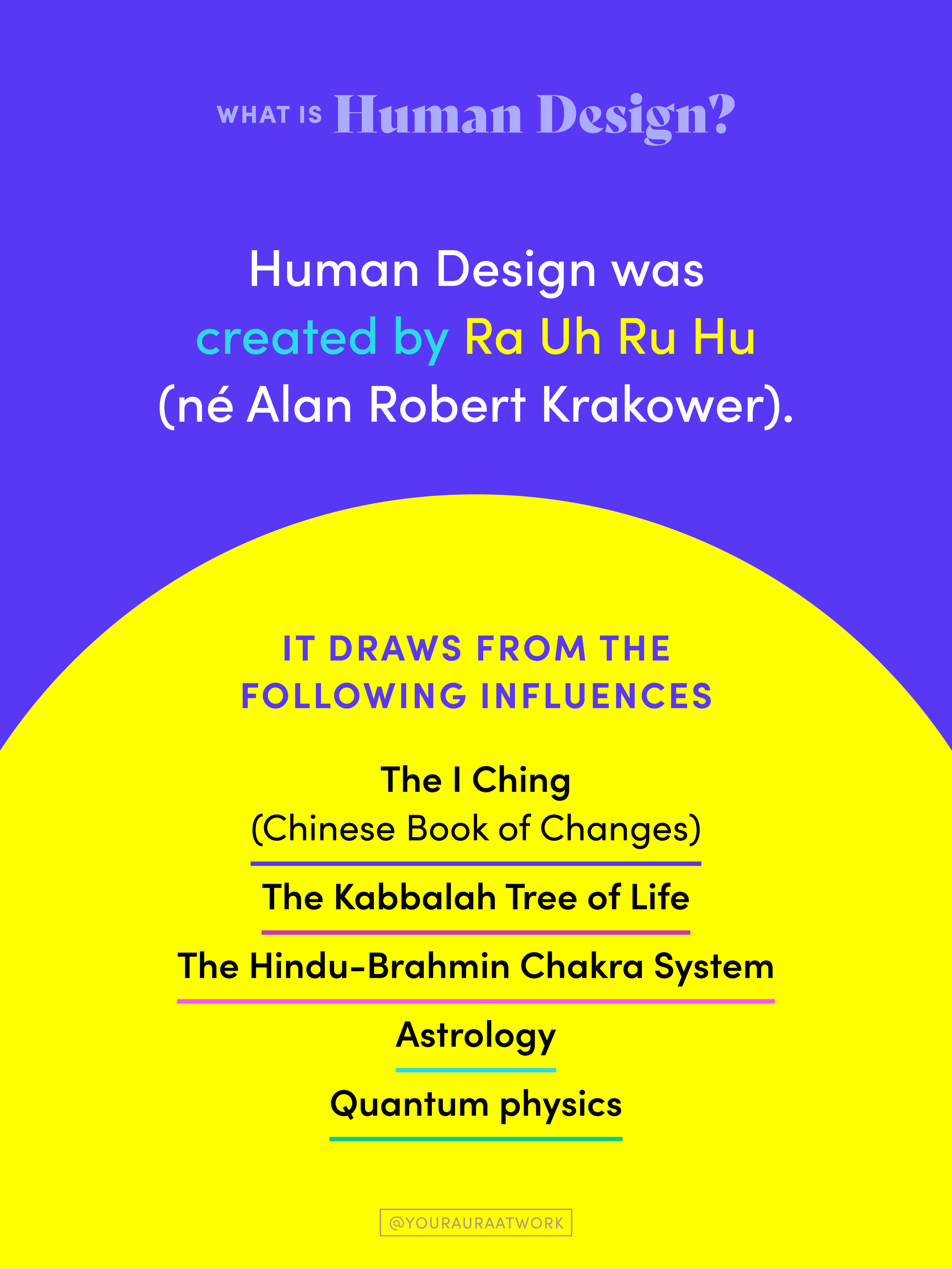
Educational Slides
We designed a series of educational posts that make the complex principles of Human Design approachable, engaging, and easy to understand.