Clingy Tarts
Case Study
BRANDING
IDENTITY
PACKAGING
WRITING
Photo by Chiara Peretti
-
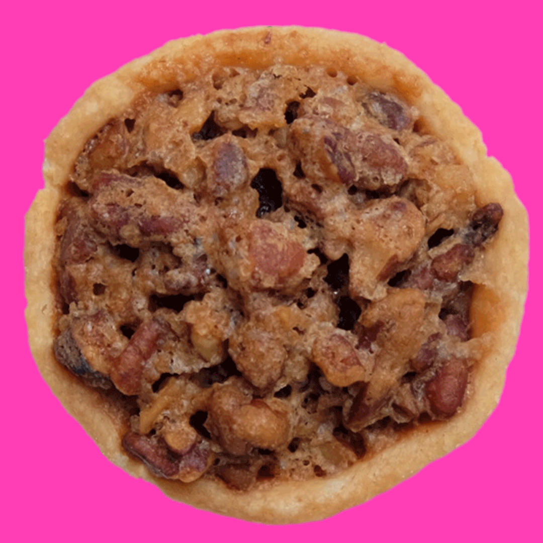
Jaryl needed an identity and Instagram presence for his burgeoning pecan tart business along with a way to package his product for local delivery.
-
We designed a logo and brand system representative of Clingy, the brand’s mascot. We sourced and branded packaging well suited to transporting the small, delicate tarts, and established a lively Instagram presence.
-
Visibility through Instagram followers rose and sales increased 30% after brand launch.
“Working with Radish Studio was better than I could have imagined! Nevine was very thorough with each step of the process, and every detail was measured out and mixed together for sweet perfection. Bravissima!”
JARYL, CLINGY TARTS
Primary & Secondary Logos
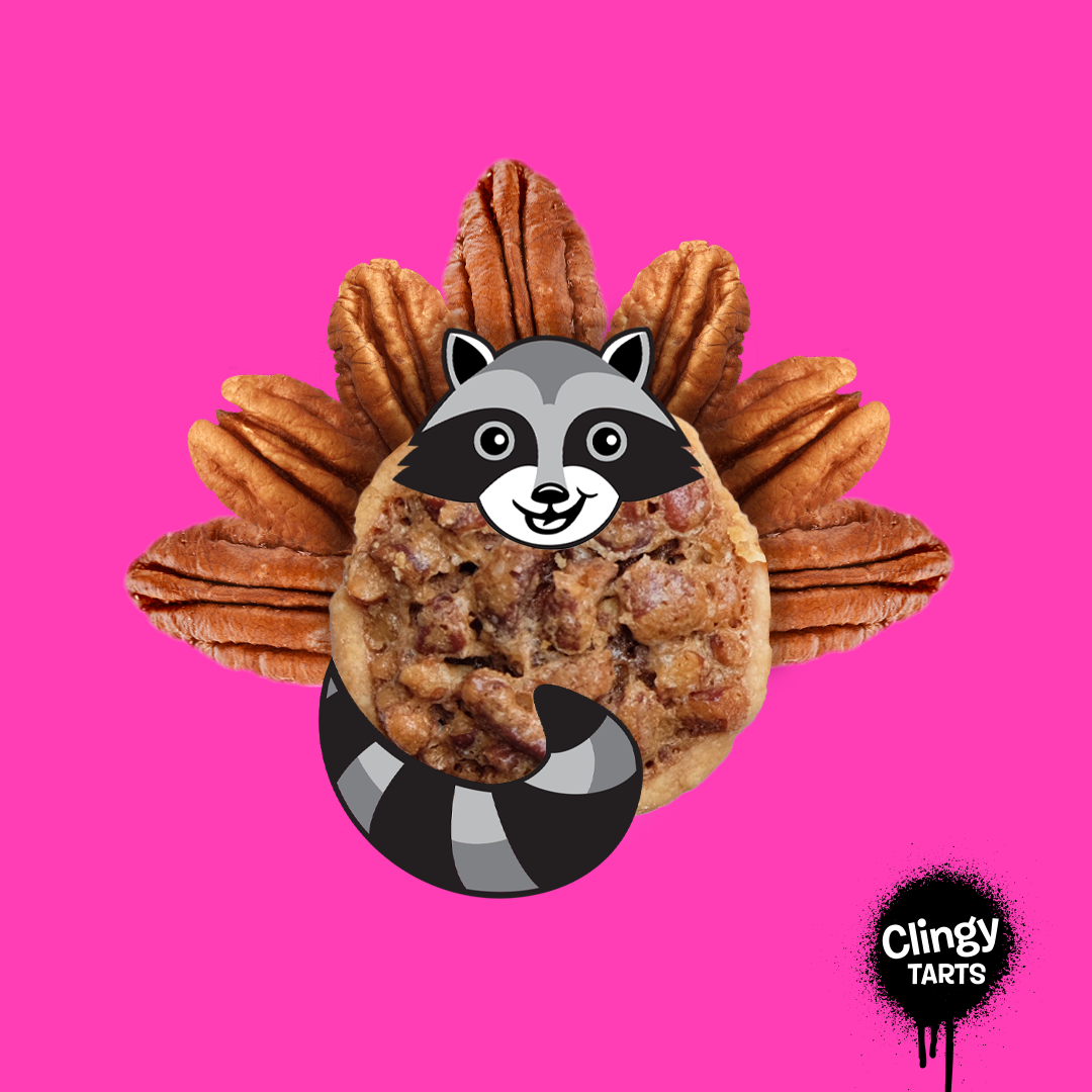
Clingy’s personality was modeled after Jaryl’s alter-ego: An awkward, troublemaking, graffiti-spraying skateboarder. Neon pink is inspired by the 80s, and the type further emphasizes the brand’s playfulness.


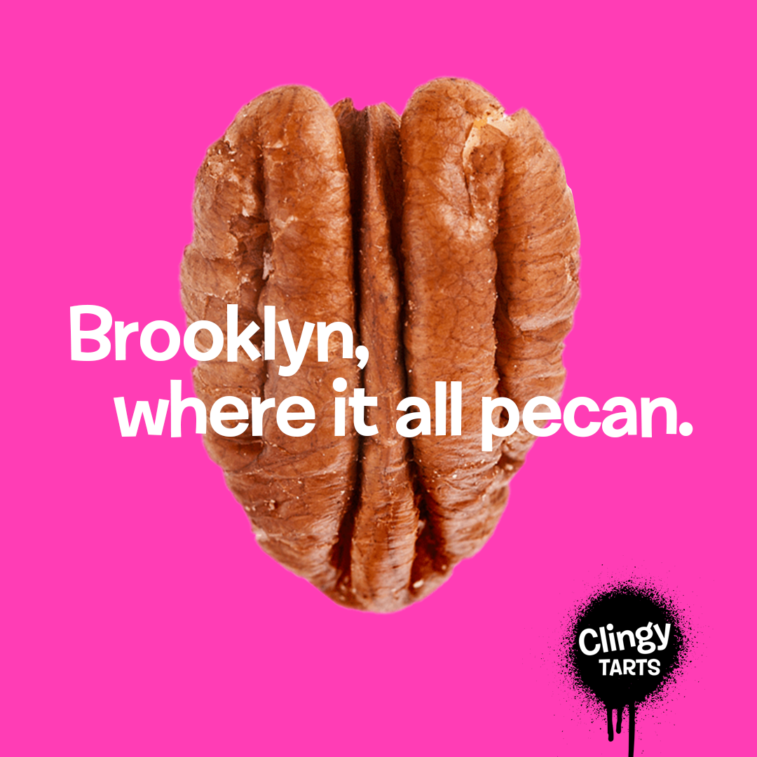
Brand Voice
Of course a hijinx-loving raccoon loves Dad joke-level puns! So puns we made. Clingy wouldn’t have it any other way.
Print Materials
Promotional print materials included business cards and various packaging materials.


Photo by Chiara Peretti
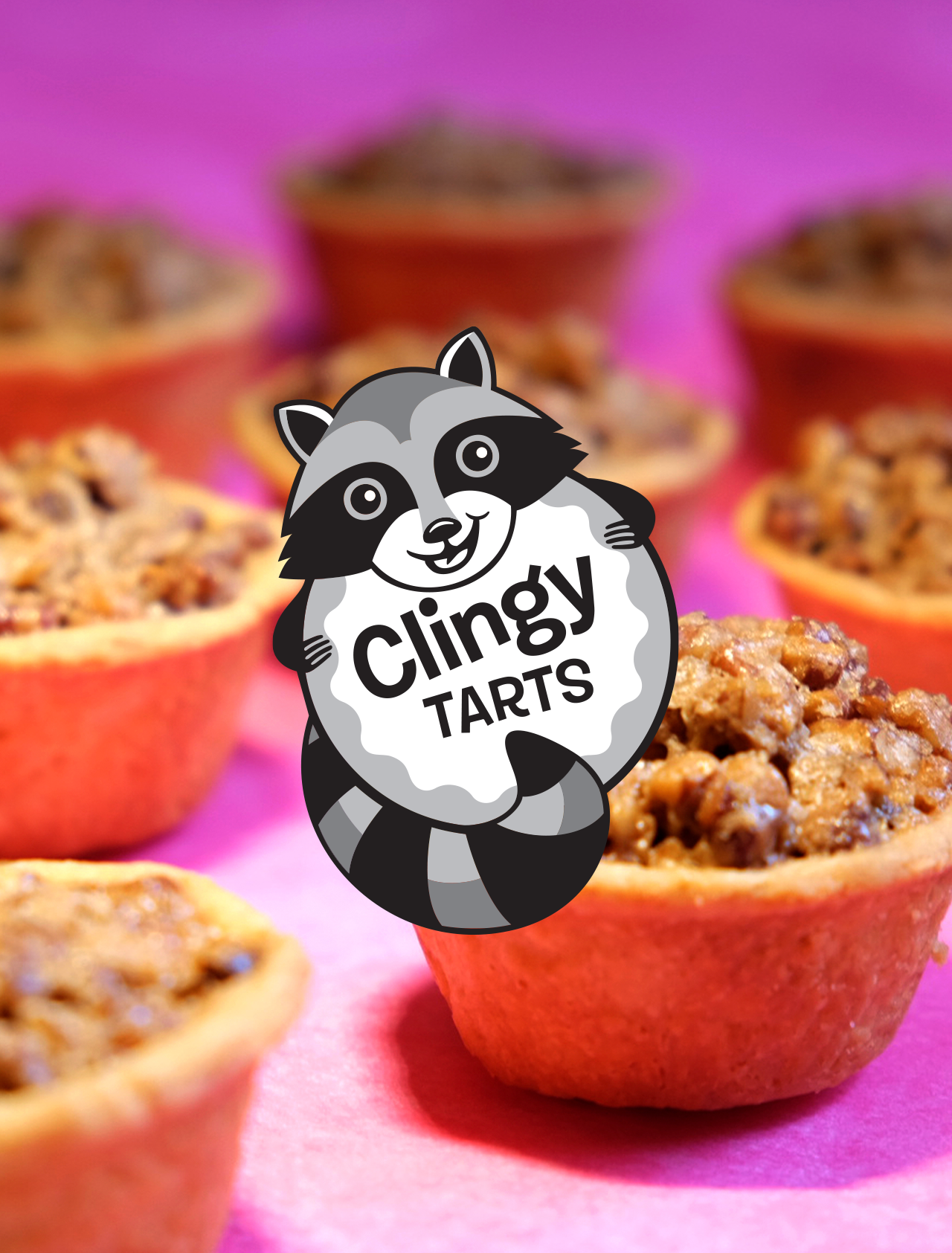
Packaging
Tart packaging was chosen specifically for local delivery and brand elements were used to label and decorate.


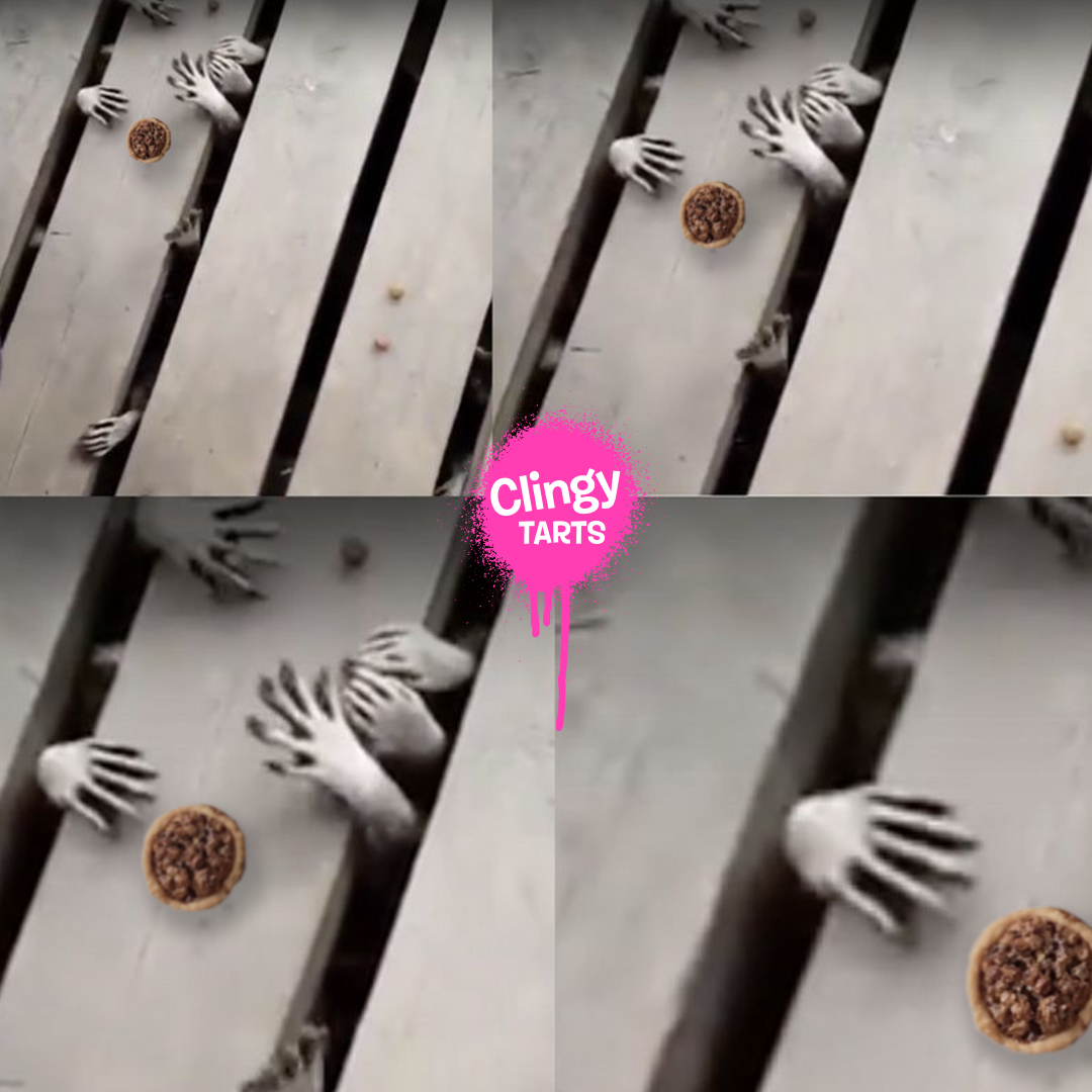
A big part of establishing the Clingy brand was creating a presence on Instagram. This is where all the branding elements of color, form and content came together. We created a teaser of 6 posts that made up one image containing a couple of ‘easter eggs.’ On the 7th day we revealed the logo underneath a tart being eaten in the form of an animated gif.